
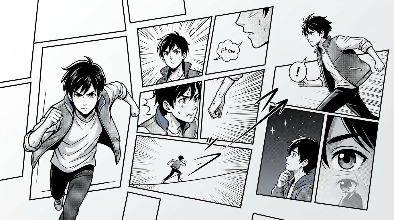
Manga doesn’t need dialogue to make you cry, laugh, or hold your breath. The panels themselves do the heavy lifting. A character standing alone in a wide shot can communicate loneliness better than a paragraph of internal monologue. A sudden shift from large to tiny panels can make your heart race during a fight scene. These aren’t accidents. They’re deliberate choices that turn static images into flowing narratives.
Manga panels tell stories through size, shape, placement, and negative space. Artists control reading speed with panel density, convey emotion through framing choices, and guide eye movement using gutters and composition. Mastering these [visual grammar](https://en.wikipedia.org/wiki/Visual_grammar) rules allows creators to communicate complex narratives, build atmosphere, and evoke powerful responses without relying on text. Understanding panel language transforms sequential art from illustrations into immersive storytelling.
Panel Size Controls Your Reading Speed
Big panels make you slow down. Small panels speed you up.
When a mangaka wants you to absorb an emotional moment, they’ll give it a full page. The character’s expression fills your vision. You can’t rush past it. Your eye naturally pauses on larger images, giving weight to that particular beat in the story.
Tiny panels create urgency. Action sequences often use rapid-fire small frames because your eye zips through them. This mimics the frantic pace of combat or chase scenes. Four small panels in a row feel faster than one large panel, even if they show the same amount of time passing.
Consider how different it feels when a mangaka shows a sunset in a thin horizontal panel versus a full splash page. The thin panel suggests time passing in the background. The splash page turns that sunset into a significant story moment, perhaps marking a character’s decision or the end of an era.
Panel density on a page creates rhythm. Pages with many small panels feel busy and energetic. Pages with two or three large panels feel contemplative or dramatic. Alternating between these rhythms keeps readers engaged and prevents monotony.
Shape and Border Choices Carry Meaning
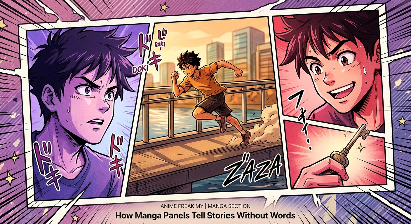
Rectangular panels with clean borders represent normal reality in most manga. Breaking that convention signals something important.
Borderless panels, called bleeding panels, suggest limitlessness or freedom. When a character breaks free from constraints, mangaka often remove panel borders entirely. The image extends to the page edge, symbolising escape from boundaries.
Jagged, irregular panel borders indicate chaos, violence, or psychological distress. A calm conversation uses straight lines. A mental breakdown uses fractured, overlapping shapes that feel unstable.
Circular or curved panels create softness. Flashback sequences and dream states frequently use rounded borders to separate them visually from present-day events. The gentle curves signal a shift in reality or time.
Overlapping panels show simultaneous action or create visual hierarchy. When one panel overlaps another, the top layer demands attention first. This technique helps control reading order on complex pages.
| Panel Technique | Emotional Effect | Common Usage |
|---|---|---|
| Full bleed (no borders) | Freedom, transcendence | Breakthrough moments, epic reveals |
| Thin horizontal strip | Time passing, transition | Scene changes, montages |
| Jagged borders | Chaos, violence | Action climaxes, psychological breaks |
| Circular frames | Softness, memory | Flashbacks, dreams, gentle moments |
| Overlapping layers | Simultaneity, depth | Complex action, cause and effect |
Negative Space Speaks Volumes
Empty space isn’t wasted space. It’s a storytelling tool.
When a character experiences isolation, mangaka surround them with white emptiness. The figure becomes small against vast blankness. You feel their loneliness without reading a single word.
Negative space also controls focus. A detailed background distracts from the subject. Removing background detail forces your eye to the character’s expression or a specific object. What the artist chooses to omit matters as much as what they include.
Japanese manga uses white space differently than Western comics. The ma concept, meaning interval or pause, treats emptiness as an active element. Silence has texture. A panel showing only sky or empty hallway communicates mood and gives readers mental breathing room.
Strategic emptiness also affects pacing. After intense action sequences, a panel of pure white or black gives readers a moment to process. It’s the visual equivalent of a rest in music, making the next beat hit harder.
Gutter Width Controls Time Perception
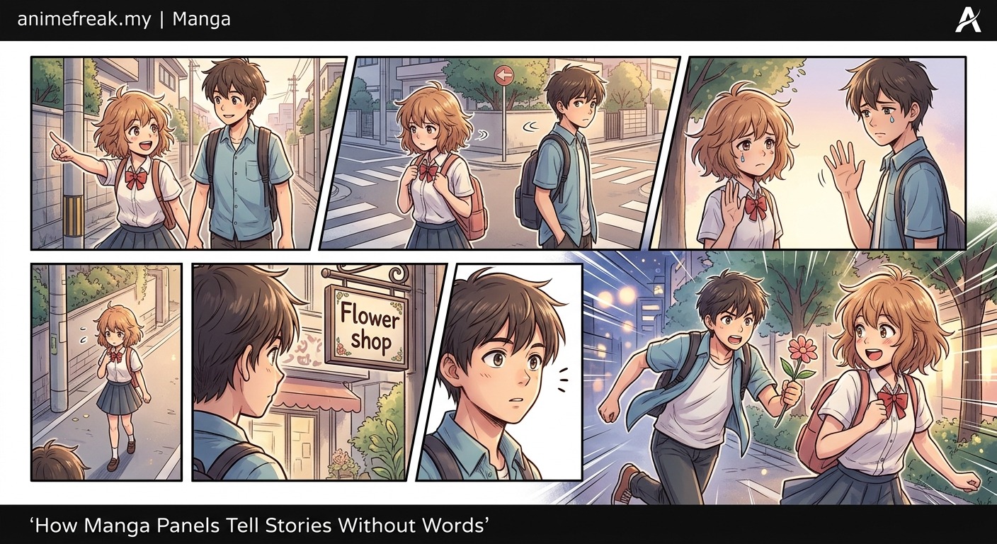
The space between panels, called the gutter, represents time passing.
Narrow gutters suggest immediate succession. Events flow directly from one to the next with minimal pause. Wide gutters indicate longer time gaps or significant transitions.
Some manga eliminate gutters entirely, butting panels directly against each other. This creates breathless pacing where moments cascade without pause. It’s exhausting and thrilling, perfect for climactic sequences.
Other pages use gutters so wide they become design elements. A character standing at a crossroads might have panels separated by thick black bars, each bar representing the weight of their decision.
Readers unconsciously fill gutters with implied action. If panel one shows a character reaching for a door and panel two shows them inside, your brain supplies the opening and walking through. Mangaka use this psychological tendency to compress or expand time elegantly.
Reading Flow Gets Engineered
Japanese manga reads right to left, top to bottom. Artists design pages assuming this eye movement pattern.
Panel placement guides your gaze through the intended sequence. Misplaced panels confuse readers or break narrative flow. Professional mangaka sketch reading paths, ensuring each panel leads naturally to the next.
Diagonal compositions pull eyes in specific directions. An action line moving from top right to bottom left accelerates the rightward reading flow. Lines moving against the natural reading direction create visual tension or indicate reversal.
Circular compositions trap the eye, making readers linger. A character surrounded by attacking enemies might be framed in a spiral of panels, forcing you to circle the page and experience their surrounded state viscerally.
“The panel is not just a container for images. It’s a unit of time, a window into a specific moment, and a tool for controlling how readers experience the story. Master the panel, and you master manga storytelling.”
Character Placement Within Frames
Where you position a character in their panel changes everything.
Centred subjects feel stable and important. Off-centre placement creates dynamism or unease. A character pushed to the panel’s edge looks constrained, trapped, or about to exit the scene.
Looking room matters. If a character faces right, leaving space on the right side of the panel feels natural. Eliminating that space and pushing them to the right edge creates claustrophobia or suggests they’re blocked.
Vertical placement carries meaning too. Characters positioned in the upper portion of panels gain authority and power. Those in the lower section appear vulnerable or defeated. It’s subtle visual hierarchy that readers process unconsciously.
Eye level affects reader connection. Panels drawn at eye level create equality between reader and character. Low angles make characters imposing. High angles diminish them. Switching angles within a conversation can show power dynamics shifting.
Silent Sequences Demonstrate Mastery
The true test of visual storytelling is the silent sequence. No dialogue, no narration, just panels.
Skilled mangaka can convey entire emotional arcs without text. A character waking, seeing an empty bed, touching cold sheets, staring at a photograph, and crying tells a complete story of loss. Each panel builds on the previous, accumulating emotional weight.
Silent sequences require precise panel choices:
- Establishing shots orient readers to location and time
- Close-ups on hands, eyes, or objects reveal inner state
- Environmental details reflect character emotion
- Panel rhythm matches the character’s mental state
- Negative space amplifies isolation or peace
These sequences often become the most memorable pages in a manga. They demand reader participation. You construct meaning from visual cues rather than consuming pre-written explanations. This active engagement creates stronger emotional responses.
Transition Types Between Panels
Scott McCloud identified six types of panel transitions. Manga uses all of them strategically.
- Moment to moment: Tiny increments of time, like blinking or a ball bouncing. Creates slow motion effect.
- Action to action: Single subject progressing through action. Standard narrative progression.
- Subject to subject: Staying in scene but shifting between subjects. Conversation panels use this.
- Scene to scene: Jumping across distance or time. Requires reader inference to bridge gaps.
- Aspect to aspect: Different aspects of same place or mood. Builds atmosphere without advancing plot.
- Non-sequitur: No logical relationship between panels. Used for surreal or comedic effect.
Varying transition types creates texture in your storytelling. Pages using only action-to-action transitions feel mechanical. Mixing in aspect-to-aspect panels for atmosphere and scene-to-scene jumps for pacing creates richer reading experiences.
Common Panel Mistakes to Avoid
Even experienced artists make these errors:
- Inconsistent reading flow: Panels that don’t follow natural eye movement confuse readers
- Overcrowded pages: Too many panels crammed together creates visual noise
- Monotonous sizing: Every panel the same size feels flat and boring
- Unclear time passage: Readers can’t tell if seconds or hours passed
- Ignoring negative space: Filling every millimetre makes pages exhausting
- Poor hierarchy: No clear entry point, eye wanders aimlessly
- Mismatched content and size: Giving minor moments large panels while rushing important beats
Study published manga critically. Notice which pages flow effortlessly and which make you pause to figure out reading order. The invisible craft is often the most skilful.
Emotional Framing Techniques
Framing choices communicate psychological states without exposition.
Tight framing, cropping close on a face, creates intimacy or claustrophobia depending on context. You’re forced into uncomfortable proximity with the character’s emotions.
Wide framing, showing a character small within their environment, emphasises their relationship to space. Are they dwarfed by nature, trapped in urban sprawl, or commanding a battlefield? The same figure reads differently based on surrounding space.
Dutch angles, tilting the panel itself, signal disorientation or wrongness. The world literally appears off-kilter, matching character confusion or danger.
Foreground elements partially blocking the subject suggest observation or voyeurism. Viewing a character through doorways, between people, or past objects makes readers feel like witnesses rather than omniscient observers.
Why Visual Grammar Matters for Your Work
Understanding how manga panels tell stories separates amateur work from professional craft. You’re not just drawing pictures in boxes. You’re conducting visual symphonies where every element serves the narrative.
Start simple. Take a basic scene and panel it three different ways. Notice how changing panel size, number, and arrangement alters the emotional impact. That’s your laboratory. Experiment until these choices become intuitive.
Study your favourite manga with analytical eyes. Cover the text and see how much story you can follow from panels alone. The best mangaka communicate clearly even without words. That’s the standard worth pursuing. Your panels should sing even in silence.